Wove
The current engagement ring market provides two options: the rigidity of traditional luxury, or the generic offering of DTC brands. So we built Wove to do the best of both. We crafted a timeless aesthetic that expresses our bespoke nature and bucks the industry trends, even going back to 1913 to find our brand typeface. We set Wove’s sights toward the future by pulling from the past, with a timeless brand built to out-class their contemporaries, subvert tradition and set a new collaborative standard for luxury.
-
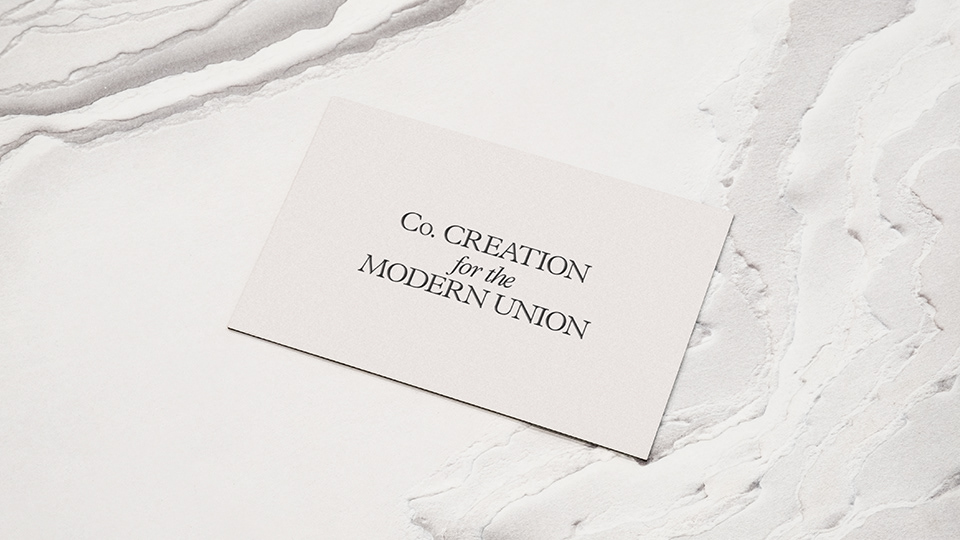
We wanted a simple name that conveyed the intertwining of 2 lives. Leaning into the collaborative process of creating bespoke rings we landed on the name Wove. The paste tense of ‘weave’. We like that it isn’t a word you come across often and the balance of round and angular characters.
-
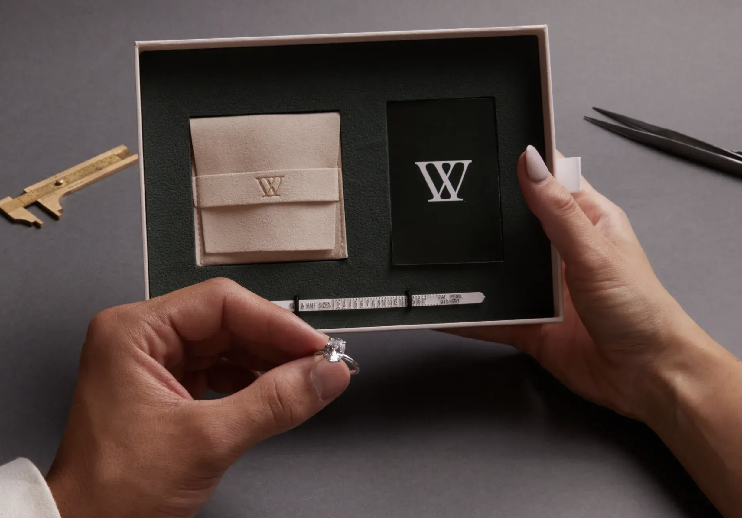
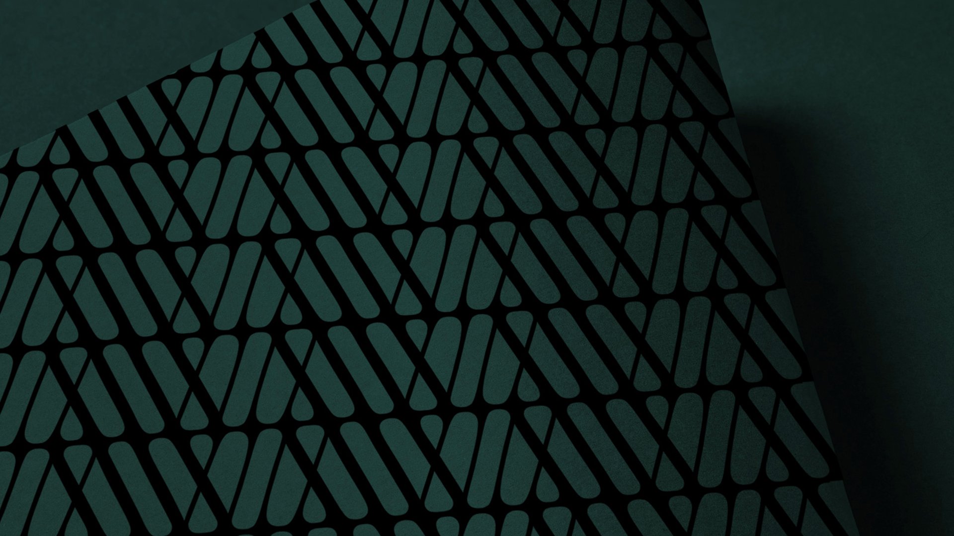
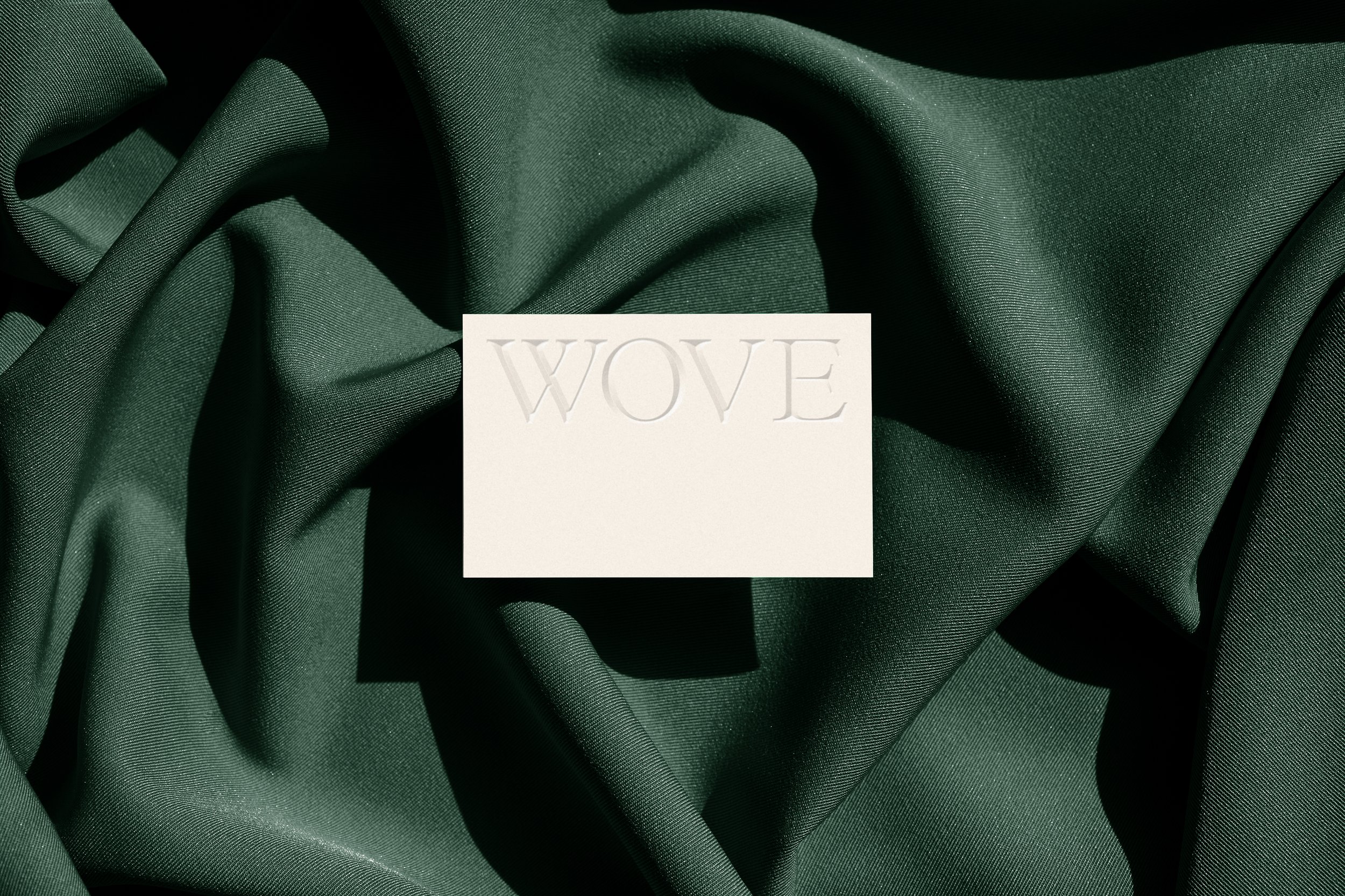
Wove is a premium custom experience and the brand needed to evoke that. We wanted to balance more traditional elements with modernity. We selected the font Plantin as the font for our word mark. It was originally designed for use in engraving and we loved the strength and wave to it. We opted for GT America as its support and to bring a bit of modern fashion into it. With combination of photography we leaned into raw materials and a deep green that has a velvety tone.
-
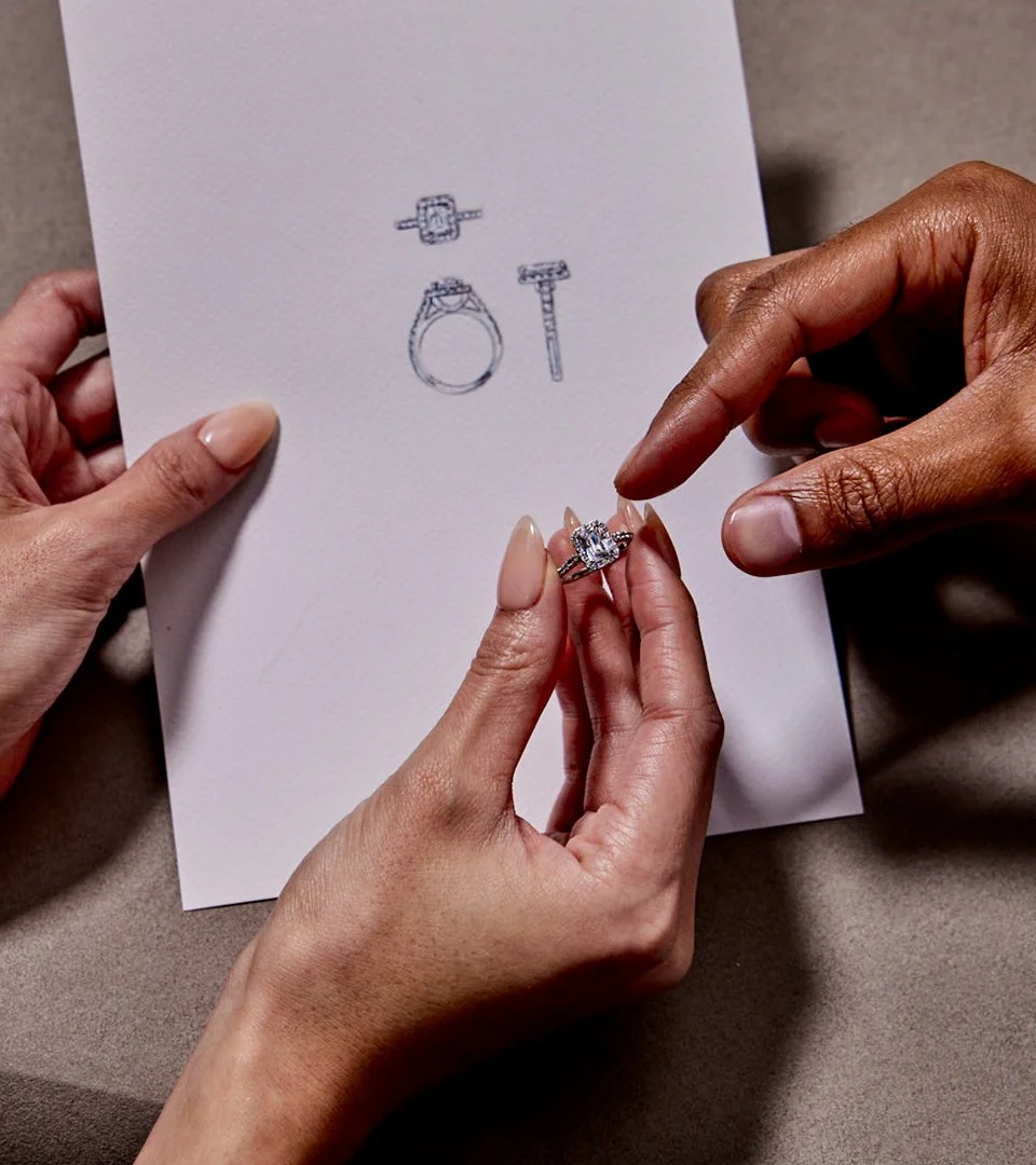
We built the original site as a custom shopify experience. Working with the team to develop some custom backend that allowed the designers and customers to communicate on the project and keep track of the progress.


Produced by Caitlin DeAngelis & Laura Hockstad
Creative & Design by Me & Brit Larson & the Bullish creative team
Photo by Henry Hargreaves
Styling by Katlin Taosaka